
When photographing pets there are many different points to consider such as lighting, background, poses and what the customer wants but often people forget about the use of different colours to enhance and supplement the photograph.
Lets start with the basics….
When we talk about colour we have primary colours – these are the colours you learnt about in primary school Red/Blue/Yellow
Next we have the secondary colours – these are what we get when we mix the primary colours – Purple/Green/Orange
And finally the tertiary colours – these are the colours in between made up of mixes of the first two groups.
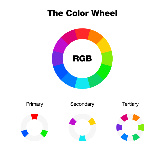
Now we know about the different types of colours, we can consider colour schemes. Again there are 3 main types of colour scheme – monochrome/analogous/complementary.
When planning your photography thought should be given on the look you are trying to achieve, will you use surrounding colours that are complimentary to your subject or similar in tone. They both give different effects as demonstrated below.
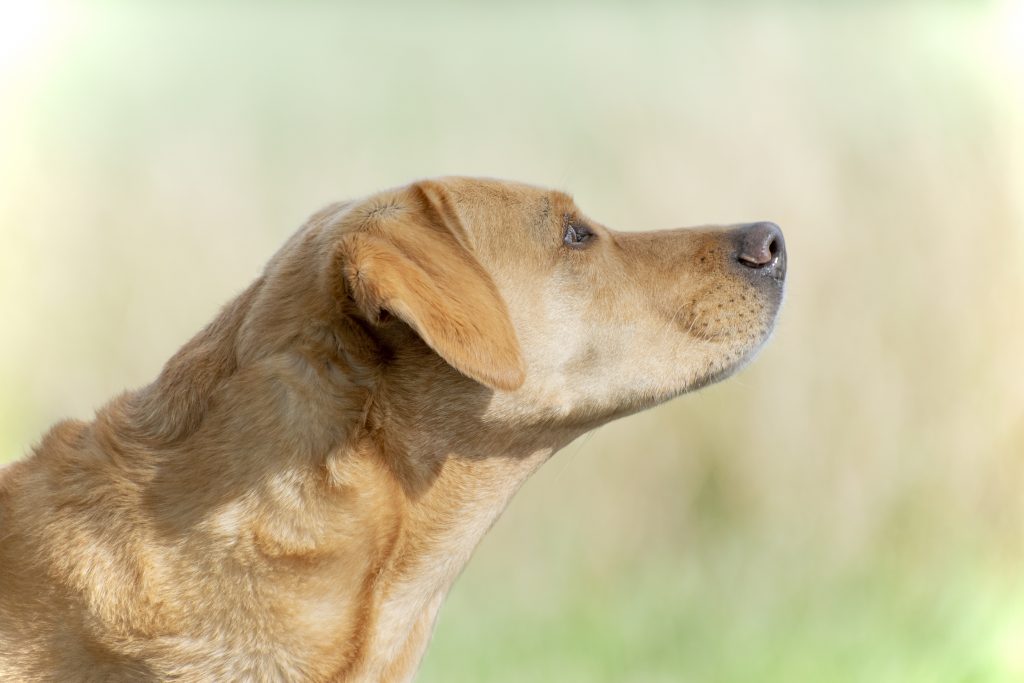
The first photograph is young Nuka on a rich and dark brown mottled black background, this dark brown picks up on the browns on the trunk and mirrors the depth of her eyes. The darker background also gives good contrast to her lighter colour.

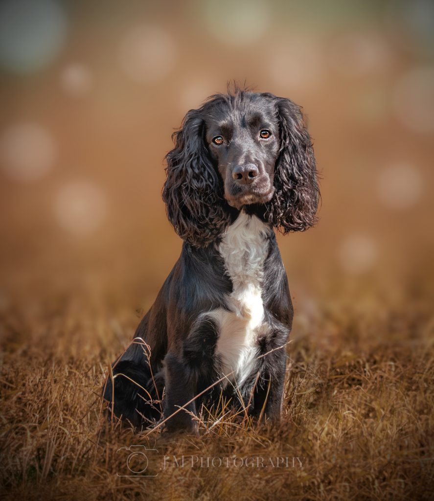
For the below photograph I made use of a Analogous colour scheme as above using colours that are close to each other on the colour wheel. This give a nice soft feel to the capture.
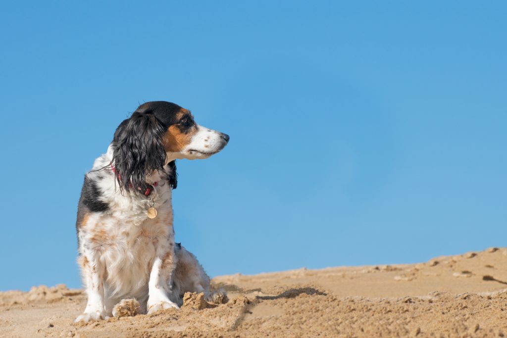
The below image of the lovely Jelly on the beach shows how the use of complimentary colours (colours opposite each other on the colour wheel) can in this case the blue of the sky and the orange in her cheek patches can compliment each other and add to the vibrancy of the capture.
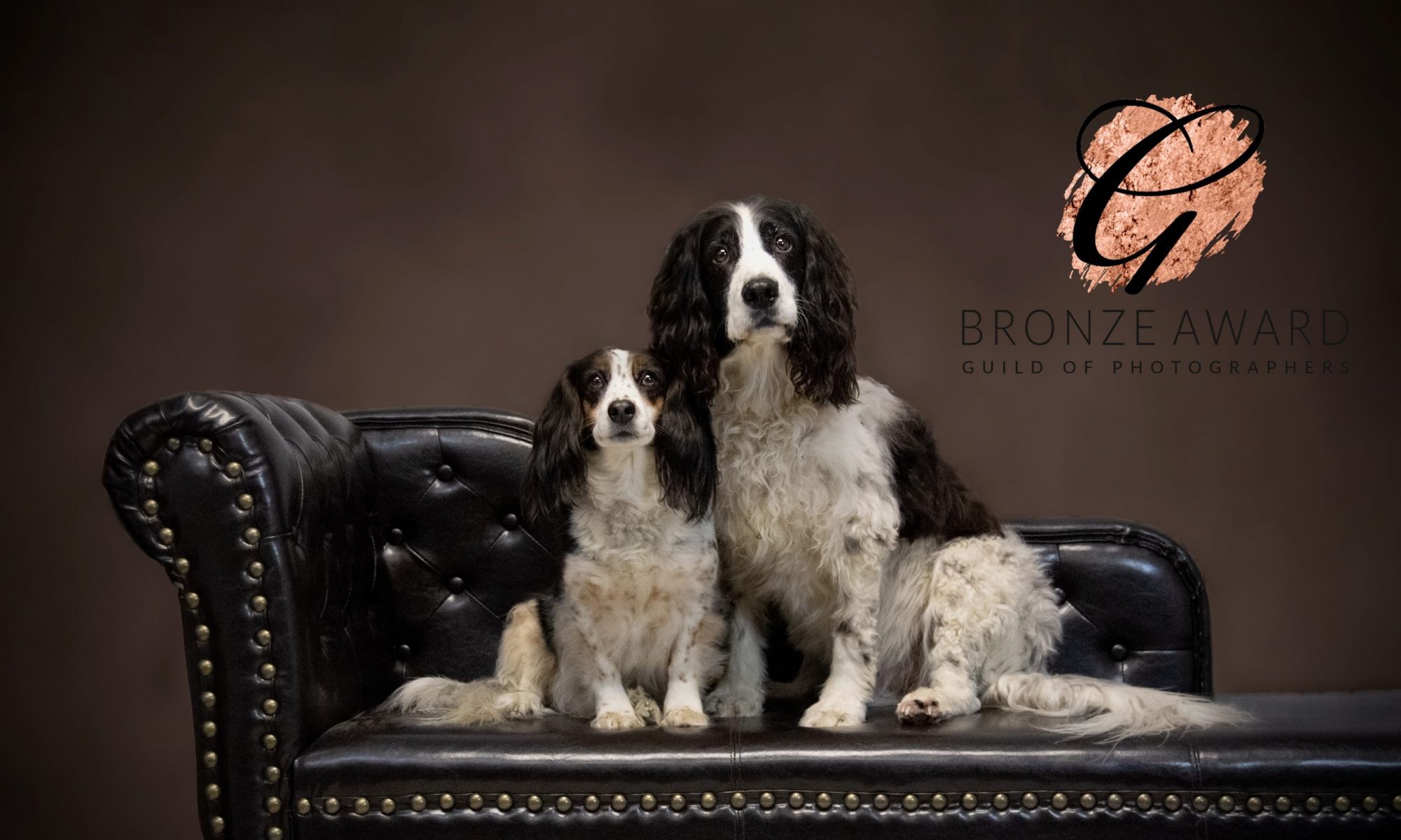
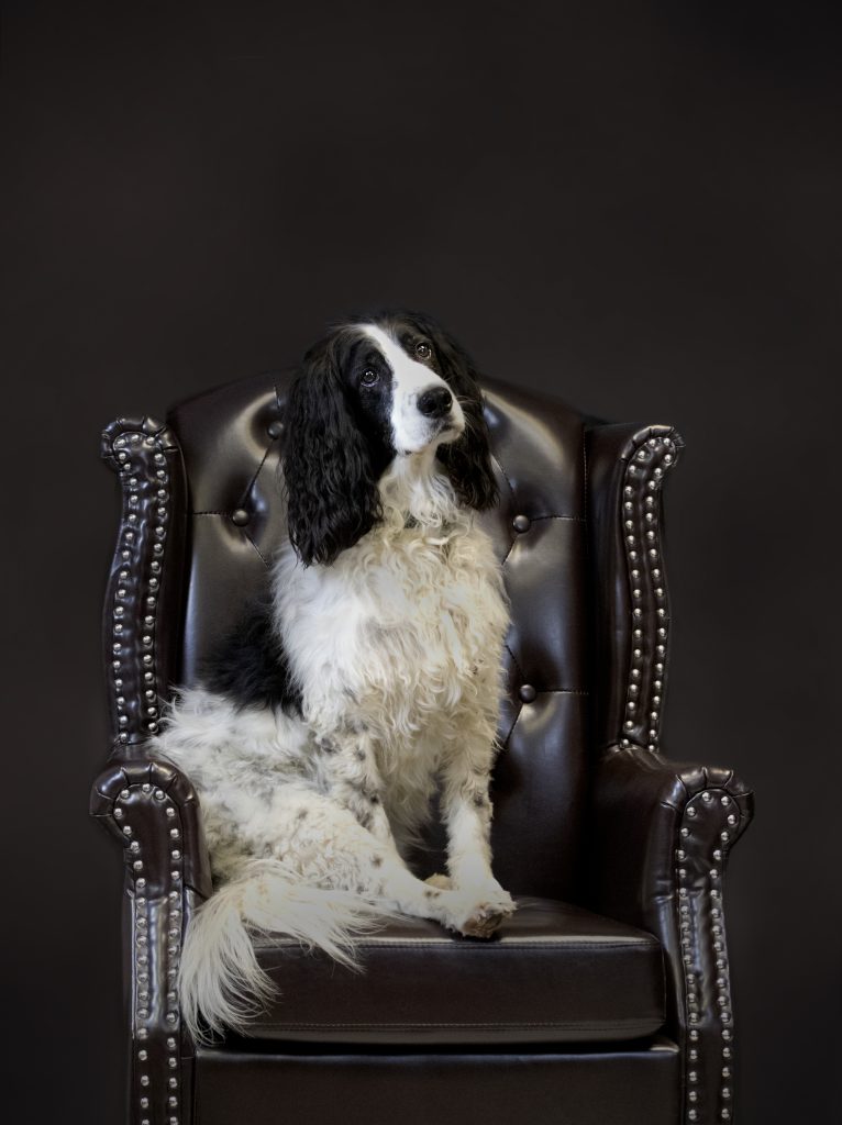
The last colour scheme that I occasionally use especially with black or black and white dogs in monochromal as demonstrated below with the lovely Beanie looking regal in his chair. Despite there being no different colours in the image, he has good contrast with his surroundings and really pops.
In summary, it is more than likely that when photographing pets that you will use an analogous colour scheme using colours similar to that of the dog, with the next most common being monochromal…..but next time you are planning a shoot see if you can find a back ground that compliments the subjects colour….you’ll be surprised by the result.
I am completing weekly blogs as part of a blog circle made up of amazing pet photographers so please go and check out the next photographer in the circle…
Those soft, muted monochromes are my favorite. Gorgeous dog portraits!
Great explanation! My favorite is the last image – beautiful brown tones.
That was really interesting to read Jemma, and beautiful images to match. Thank you!
Beautiful dog portraits! Thanks for sharing about colors. My favorite was the last one as well.
Great post Jemma, the accompanying examples really help marry the concepts together.